
Tension and Reverie
- Nov 19, 2025
- 4 min read
Updated: Mar 28

The inspiration for Tension and Reverie came from a sense of equal closeness and distance with a person – the sensation of gravity pulling two people together while circumstances prevent a true connection. It was the experience of being drawn toward someone and wanting to withdraw at the same time – attraction and protection in equal amounts.
As always with my finished work, I'll talk through the emotional spark behind this image and its specific symbolism, then I'll share the creative process – from tools and technique to the decisions that shaped the final image.

The Inspiration for Tension and Reverie
I don't know if I've ever been as strongly inspired to create an image as I was for this one. Tension and Reverie became a way to explore the excitement and restlessness I was experiencing and give those feelings space, structure, and form.
The imagery came to me in a moment – it felt revealed more than imagined. I began sketching with a sense of anticipation, and each piece of the composition began falling into place. There was a real magic to the creative process – a sense of inevitability I hadn't experienced in my creative work before.
Symbolic Choices
There's a single dynamic at the heart of Tension and Reverie: two individuals pulled together while remaining guarded. The figures mirror one another – equal, balanced, and quietly aware – yet something keeps them from properly seeing one another. Their closeness suggests connection, but the space between them reveals distance.

Each figure carries a different form of protection. For the man, a shield – blunt, heavy, and one-directional. For the woman, an orb of radiant light – warm and expressive, but casting its own shadows.
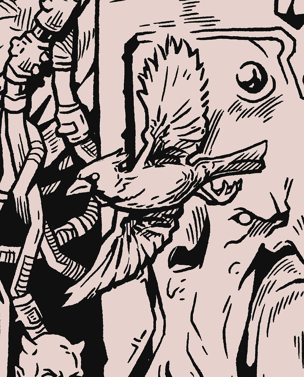
A number of imps stir restlessly below. In an otherwise serene setting, they bring the potential for calamity.
Above them, cardinals appear as a symbol of hope and clarity. In their golden hue they are small embodiments of light, reminders that even in tense circumstances, something bright is burning and always able to set itself free.

The Process for Tension and Reverie
Like all my art, this piece progressed through three distinct stages: pencil, ink, and color. Each of them held their own unique challenges and problems to solve, and it required me to make adjustments along the way to ensure this image clearly expressed the emotions behind it.
Pencil Stage
The initial drawing for Tension and Reverie was done in pencil on a piece of 14" x 17" Bristol paper. I started with loose gestures and general shapes, simply mapping out the full composition. At this stage, I wasn't concerned with fine details, just trying to lay out the essence of each figure and object.
Here's a photo of that earliest version of the drawing. Faces, proportions, and shapes are established, but the many rough edges are easy to see.

The next step was refinement. I took a second pass at the entire drawing to clarify the outlines and key details. And then, at last – a third and final pass. This time, the goal was to work out the drawing in full detail before committing to the ink process. Here, I added fine details while creating shadows and hatching lines to indicate depth and lighting.

Ink Stage
I began inking it directly on the original drawing but quickly found myself discouraged. The line work in Tension and Reverie is more subtle and delicate than many of the drawings that came before it, and any small slip with the pen or brush distorted the face or figure.
So I chose to do this one digitally in Photoshop instead. That allowed me to be true to the pencil drawing while also making subtle refinements along the way – particularly to the faces of the two main figures.

Color Stage
Here's where the image really came to life.
Just like comic book art, my color work always contains two main processes (both done in Photoshop.) The first is color separations, aka the "flat" colors – this process involves lassoing out each object in the image and assigning it a color. At this stage, I'm putting little effort into choosing specific colors – I'm just doing the work of separating each one.
As I got close to finalizing the separations, I began tweaking colors to find a palette that felt visually satisfying and also aligned with the inspiration. Those colors turned out to be rich purples and blues with golden accents.
I never anticipated them to be this vibrant, this bold, or this saturated.

Feeling surprised and excited about where I had landed, I began the second stage of the color process – the full renders.
This process involved four main stages:
Subtle gradients
Texture
Shadows and highlights
Glows and lighting effects
Once those were complete, I did a final check for details, polish, and overall balance. And then I gave it a name.
Personal Reflection on Tension and Reverie
In my work, I'm always trying to find and express the deeper meaning in the events of life. This image gave me an opportunity to lean into that in a way that few of my art pieces have, both in terms of emotional complexity and the design of the art itself.
Tension and Reverie is the expression of a moment that was beautiful and exciting – but possibly never what it seemed.
I post process videos, sketches, and behind-the-scenes work as new art takes shape. If you'd like to see the next stages of this world as it's built, you can find me here:


There's something about the castle appearing as if a thought bubble above the male creature, who sits as if on a throne no less, that contrasts with the image of factory level industrial pollution below the female creature. She's gazing at the castle (the what could be?) but rooted to the image below her. Cool; intriguing.